Graph Creation and Options
Different Methods of Creating Graphs
So far, we've seen several ways to create graphs. These methods are listed below.
- Create a graph automatically as part of using the Configuration Wizard.
- Clone an existing configuration and choose the Clone associated graphs option in the Clone Configuration dialog.
- Clone an existing graph.
- Select Graph, New Graph from the main menu, or select the Graphs node in the Data View, right-click on it and choose New Graph from the context menu.
The first three techniques do a lot of the work for you and should be used whenever possible. The third technique of creating graphs manually requires more effort.
Showing an Existing Graph That's Not Currently Visible
When you're finished looking at a graph, you can close it by clicking the close button of its tabbed window. The graph will be removed from the display area, but its contents and options are always saved so you can show the graph again at any time.
There are two ways to view a graph that's currently hidden. The first way is to locate its folder in the Data View, then right-click on it as shown below.
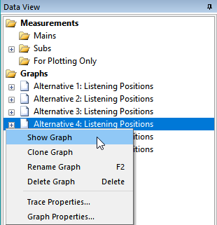
Selecting Show Graph displays the chosen graph.
The Select Graphs to Show Dialog
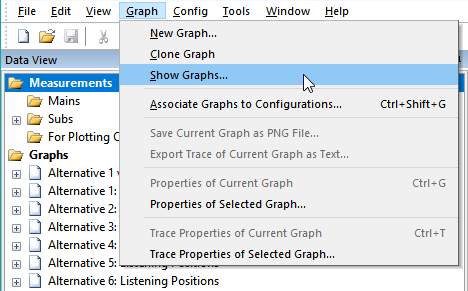
The second way to show currently hidden graphs is by using the Select Graphs to Show dialog. You can launch this dialog in two ways. From the main menu, you can choose Graph, Show Graphs as shown below.
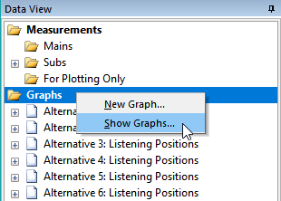
You can also launch the Select Graphs to Show dialog using a context menu in the Data View. This is done by right-clicking on the main Graphs node, then choosing Show Graphs from the context menu as shown below.
Using either of these methods results in the Select Graphs to Show dialog being displayed as below.
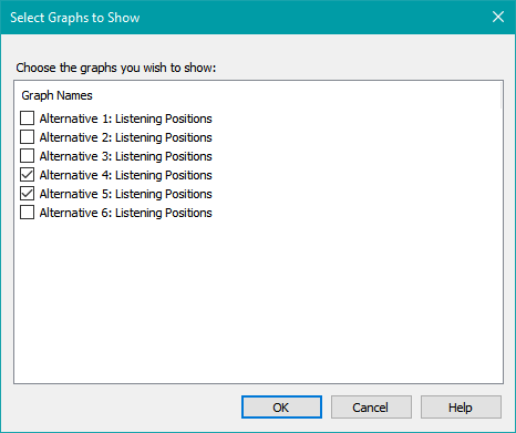
This dialog allows you to choose all the graphs you wish to show all at once. You can either use the mouse to check the desired checkboxes for the graphs you want to show, or use the keyboard up and down arrow keys to select the graph name, then use the spacebar to check or uncheck the corresponding checkbox. All unchecked graphs will be hidden, and all checked graphs will be shown.
Hiding Traces of a Graph Using the Data View
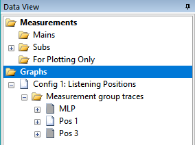
You can temporarily hide one or more traces of a graph using the Data View. To do this, first go to the Data View and expand the node for the graph so that the trace nodes are visible. Then right-click on the trace you wish to hide and choose Toggle Trace Visibility. A much faster way is to just select the trace node and use the Ctrl+Space keyboard shortcut (also shown on this context menu) to toggle the visibility of the selected trace.
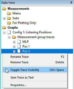
When a trace is hidden, its icon in the Data View is gray in color. This is shown below, where the MLP and Pos 3 traces are hidden, while the Pos 1 trace is visible.
You can also hide traces or individual series of a trace using some options on the Trace Properties page of the Graph Properties property sheet.
Graph and Trace Naming
Each graph in MSO has a unique name and a collection of named traces. The names of these traces must be unique within their containing graph. The relationship between graph and trace names in the Data View and the corresponding information shown by the graph itself is illustrated below.
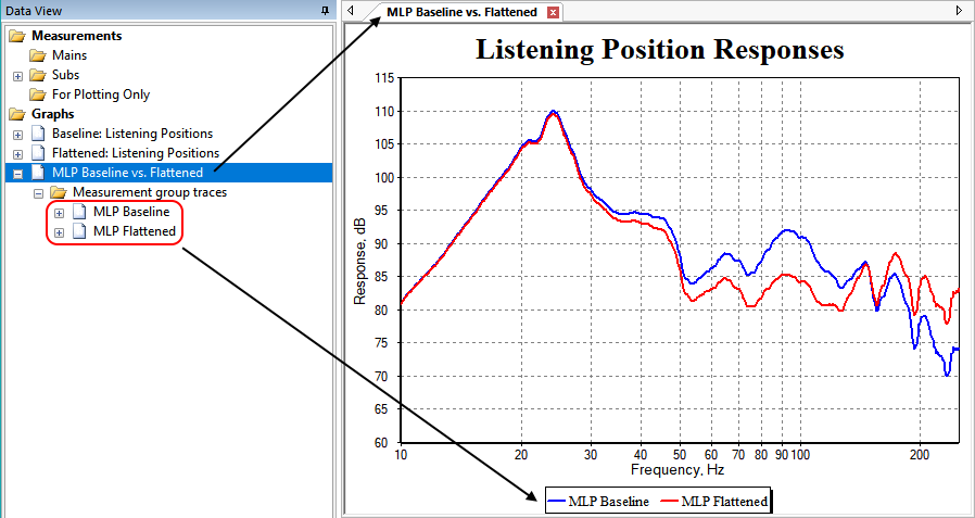
This illustration shows that the name of the graph in the Data View is the same as the name shown in the tab of the window that displays the graph. Likewise, the names of the graph's traces shown in the Data View are the same as the trace names listed in the graph's legend.
The Default Trace Names Are Often Lengthy
You can show a wide variety of types of data on the same graph, as chosen in the Data category of the Graph Properties property sheet. When a trace is added to a graph, its name is automatically generated by MSO. This name may include a lot of information about the type of data represented, which configuration it's for, which channel is being plotted, and so on. These lengthy names often cause the legend to become overrun.
Most graphs you create have a very specific purpose though, so in most cases it's easy to understand what the trace represents without all that additional information. For instance, the graph might contain only traces pertaining to one configuration. In such cases, you might remove the configuration name from any traces whose names contain it. Beginning with MSO 2.2, there are multiple ways to manually enter such shortened trace names.
Renaming Graphs and Traces
The original way of renaming a graph or trace, which also works for earlier versions of MSO, is shown below. You select the appropriate folder node of the Data View and press F2 to edit the name in place.
Renaming Graphs
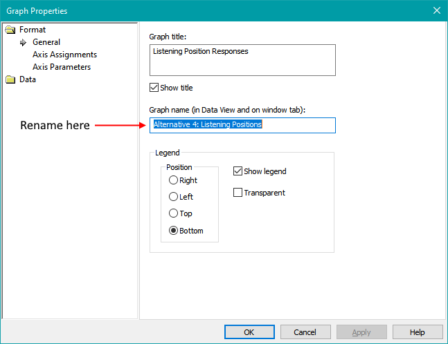
Renaming a graph using the Graph Properties property sheet is also possible. We'll talk about this property sheet in detail shortly. Shown below is the method for renaming a graph from the General property page of the Graph Properties property sheet.
Renaming Traces
You can also rename a trace from the Trace Properties page of the Graph Properties property sheet as shown below.
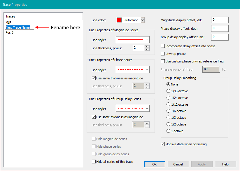
To rename the trace, select its node in the tree and press F2 to edit it in place.
All graph and trace modifications are done using the Graph Properties property sheet as discussed below.
Launching the Graph Properties Property Sheet
You can launch the Graph Properties property sheet in several ways.
-
For the currently active graph, you have these choices:
- Press Ctrl+G.
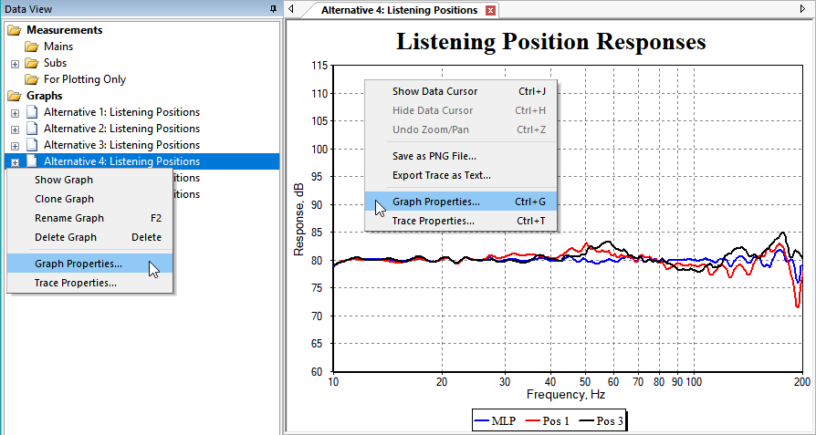
- Right-click on the graph itself and choose Graph Properties (see illustration below).
- From the main menu, choose Graph, Properties of Current Graph.
-
For a graph that may not currently be shown, you have the following choices:
- Right-click on the graph's name in the Data View and choose Graph Properties (see illustration below).
- From the main menu, choose Graph, Properties of Selected Graph.
Two such approaches are illustrated below.
When you choose Graph, Properties of Selected Graph from the main menu, a graph picker dialog will be shown as below.
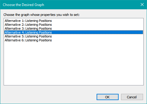
Select the desired graph from the list and either double-click it, press Enter, or press the OK button.
Using any of these methods will cause the Graph Properties property sheet to appear as shown below.
On the left side of the property sheet are categories of data you can choose to modify. The available categories are Graph Format (the appearance of the graph), Trace Data Types (which information you want to plot on the graph), and Trace Properties (the characteristics of each individual trace on the graph). We'll describe each of these categories shortly.
Using the Graph Properties Property Sheet
To show the help for the property page you're working on, make sure the focus is on a control of the page, then press F1 or click the Help button.
If the Windows focus is on the tree control on the left side of this property sheet or on one of its buttons, pressing F1 or clicking the Help button will take you to the help for the property sheet itself (this topic). That may not be what you want.
Some Terminology for Graphs
MSO uses the following terms for graphs:
- A trace refers collectively to all the data that can be plotted for the chosen quantity (such as the response at the MLP).
- A series type is a category of data that can be obtained from the trace (such as magnitude in dB, phase in degrees, and group delay in ms).
- A series refers to a plot line that appears on the graph. It is an instance of a series type.
Resizing the Property Sheet
For the property pages shown below whose list includes a configuration name for each trace, a very long configuration name might be cut off due to the limited column width of the list. This can happen in the Filter Channels property page shown below. If you experience this, you can resize the property sheet to make it wider. When you do, the columns of the list control become proportionally wider. You can also make the property sheet taller in a resize operation, allowing a larger number of trace candidates to be seen without scrolling.
Using the Apply Button
The Apply button of this property sheet allows you to see the effects of your changes on the graph right away without needing to close the property sheet. It is automatically enabled after changes to any property page have been detected. If the Apply button is enabled, this indicates the graph may not be up to date. Click Apply or press Alt+A to see all your changes. After you apply the changes, the Apply button will be disabled again to indicate that everything is up to date. Any further changes will re-enable the Apply button.
Navigating to Another Page Does the Same Thing as the Apply Button
As you navigate from one property page to another, pending changes on the page from which you are navigating are automatically saved to the graph as if you had pressed Apply. This means you only have to press Apply when trying out different options while staying on the current page.
Apply Is Not Needed When Using the Trace Properties Property Page
The Trace Properties property page (discussed below) does not require the use of the Apply button. Many small adjustments can be done with graph traces and series. For convenience and the ability to make rapid changes, these are immediately applied as you enter them on this property page.
Property Pages: The Graph Format Category
The Format category of the Graph Properties property sheet is for options that affect the appearance of various graph elements, excluding traces. The property pages in this category will be discussed next.
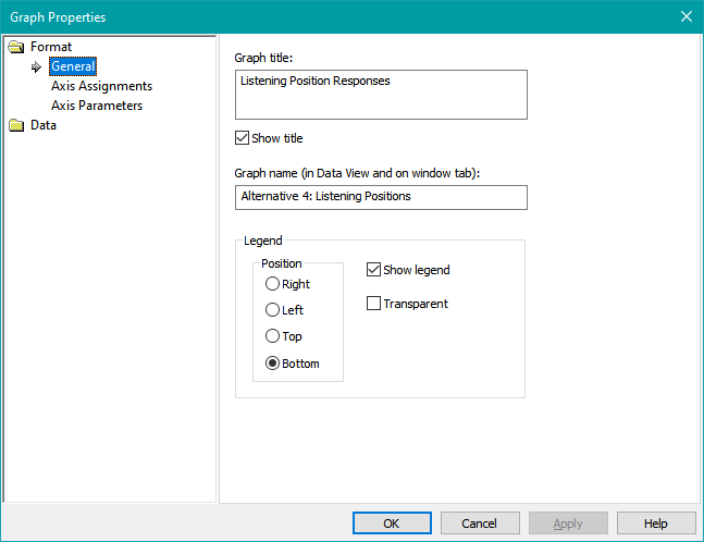
The General Property Page
When you first launch the Graph Properties property sheet, the General property page is shown as illustrated below.
The Graph Title edit control allows you to specify a title that appears above the top x axis. This can be a multi-line title if desired. For a multi-line title, just press Enter after typing in the first line of the title. This will create a new line in the edit control. The lines of the title will correspond to the lines displayed in the edit control.
Unchecking the Show Title checkbox allows you to hide the title if you need more room in your graph. This checkbox should normally be checked.
You can rename the graph using the edit control labeled Graph name (in Data View and on window tab) as shown in the image above.
The Legend controls Right, Left, Top and Bottom allow you to specify the location of the legend. If you don't want a legend, uncheck Show Legend. If you want the legend to be transparent, check the Transparent checkbox.
The Axes Property Page
The Axes property page is shown below.
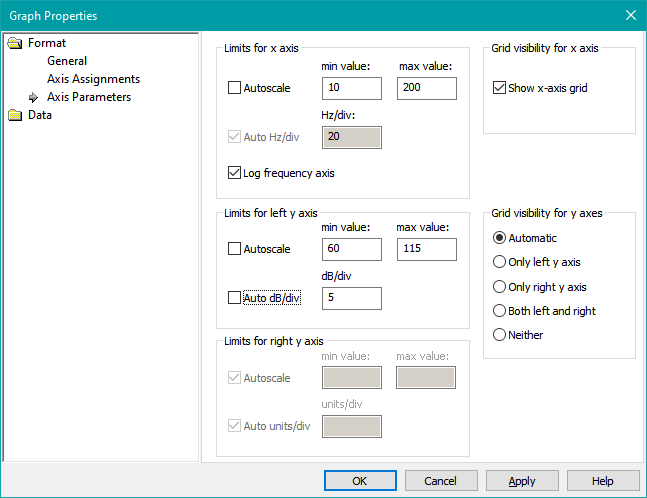
General Characteristics of This Page
The appearance and state of activation of the axis limit controls of this property page depend strongly on how you've assigned the axes using the Axis Assignments for Series Types list control at the top left of the property page. To keep things simple, it's best to first use this list control to select the type of data you wish to appear on each axis before specifying the axis parameter values. This isn't strictly necessary, as the axis limits for each category of data you may wish to plot are never lost after you enter them. This is discussed in more detail below.
For instance, the image above shows that all the controls in the Limits for right y axis control group are disabled. This happens when you choose one of the options that leave the right y axis unassigned. Other, more minor differences exist as well. The units shown in the "units/div" entries will vary with the selection of axis assignments. In the descriptions below, text such as "units/div" may be used. The actual text displayed might be "dB/div", "deg/div" or "ms/div" depending on the series type assigned to that axis. If no series type is assigned to the right y axis, "units/div" is displayed as above.
The axis parameters are stored in a way that associates them with the series type for which they are entered. You might have, say, phase on the right y axis and specify custom limits for it. You could later switch to group delay for the right y axis. If you decide to switch back to phase again for that axis, the custom axis settings you entered earlier for phase will be restored.
The Axis Assignments for Series Types List Control
The Axis Assignments for Series Types list control allows you to specify the association of series types to y axes. If only one series type is to be displayed for all traces, it can only be displayed on the left y axis. When two series types are displayed, this list control allows you to select the axes on which they appear.
The Default Phase Display for New Traces Radio Buttons
You can avoid the "jumps" in the display of phase response vs. frequency by enabling phase unwrapping. The option you choose here only affects traces you add after choosing the option. You can choose to enable or disable phase unwrapping for any trace individually using the Trace Properties dialog.
The Target Curve Display Radio Buttons
Target curves can be displayed in two different ways.
- Shift to reference level (the default for projects created under MSO versions 1.1.1 and later) shows target curve traces shifted so that their level in dB SPL at the highest optimization frequency is set equal to the reference level.
- Normalize to 0 dB (the default for projects created under MSO versions prior to 1.1.1) shows target curve traces normalized so that their level at the highest optimization frequency is set to 0 dB.
The Limits for x Axis Control Group
In the Limits for x axis control group are several controls that allow you to adjust the scaling of the x axis (frequency axis). When Autoscale is checked, the x-axis limits are determined automatically based on the frequency range of your data. When Autoscale is unchecked, you can enter the minimum and maximum x-axis values in the min value and max value fields respectively. The default setting for these options is manual scaling with a frequency range of 20 Hz - 200 Hz. If Log frequency axis is checked, the graph will have a logarithmic frequency scale (recommended). Otherwise the x axis will have a linear frequency scale. The Auto Hz/div can only be changed from its default checked state when both Autoscale and Log frequency axis are unchecked. That means it can only be used when the x axis has a linear frequency scale with manually-chosen minimum and maximum frequencies.
The Limits for Left y Axis Control Group
The Limits for left y axis control group is similar. The Autoscale checkbox is checked by default, preventing data from being off-scale when it's first displayed. This usually results in the minimum and maximum y-axis limit values not being round numbers, which looks messy. Also, if you run an optimization with the y axis set to Autoscale, the scale of the graphs will change dynamically as the optimization progresses. That can cause a lot of confusion, so the recommended approach is to use the default Autoscale mode to first determine the extent of your data, then specify manual scaling for a neat appearance. To use manual scaling, uncheck the Autoscale option and pick convenient round numbers for the minimum and maximum y-axis values, using a 0-1-2-5 sequence to get a good graph appearance. When Autoscale is unchecked, you can also uncheck Auto units/div to allow the units per division to be specified manually. When plotting magnitude in dB, a value of 5 dB/div has become a standard practice with graphs posted in online forums.
The Limits for Right y Axis Control Group
All the descriptions for the Limits for left y axis control group above apply equally to the Limits for right y axis control group. The only difference is that for axis assignments that have no series type assigned to the right y axis, the right y axis controls will be disabled as in the image above.
The Grid Visibility for x Axis Control Group
You can show or hide the x-axis grid lines by checking or unchecking respectively the Show x-axis grid checkbox.
The Grid Visibility for y Axes Control Group
The Grid visibility for y axes options are as follows.
-
Automatic:
- If only the left y axis is assigned to a series type, only the left y-axis grid lines will be shown.
- If both the left and right y axes are assigned to a series type, only the left y-axis grid lines will be shown.
- Only left y axis: Only the left y-axis grid lines will be shown.
- Only right y axis: If both the left and right y axes are assigned to a series type, only the right y-axis grid lines will be shown.
- Both left and right: If both the left and right y axes are assigned to a series type, both the left and the right y-axis grid lines will be shown.
- Neither: Neither the left nor the right y-axis grid lines will be shown.
In the vast majority of cases, you'll want this set to Automatic. In many cases, you'll have data on the right y axis and want the grid lines for the left y axis to line up with the divisions on the right. To do this, first configure the limits and units/div for the left y axis. Then specify manual limits and units/div for the right y axis and adjust them so the number of divisions on the right is the same as on the left.
Property Pages: The Trace Data Type Category
The Data category allows selection of property pages that determine which data you wish to plot. When you select an item to be plotted by checking its checkbox, you can press Apply, and the trace will be shown on the graph right away.
The added trace will also be shown automatically when navigating away from the property page from which it was added. When adding or removing traces of multiple types, this is a convenient way to avoid the need to press Apply. A similar situation occurs for trace removals.
There are a number of different types of data that can be plotted, and each data type has its own property page associated with it. These data types are as follows.
- Measurements: The raw sub or main speaker measurements as imported either using either the Measurement Import Wizard or using the various measurement import options under the main menu's File submenu.
- Filter Channels: The frequency response of a filter channel, with various options that may include or exclude any shared filters.
- Filtered Measurements: A measurement filtered by the response of the filter channel to which it is associated.
- Measurement Groups: The frequency response of a measurement group. This normally corresponds to the predicted response at a given listening position. It is computed from the complex summation of the individual filtered measurements (as defined above) in the group.
- Natural Responses: The natural response at any listening position is what you'd get without any filtering in the hypothetical case where all the subs are acoustically in phase with one another at all frequencies at that position. At the lowest frequencies, these responses show how much output you could expect with perfect phase matching. At the highest frequencies, they show what the response at that position would be without any phase-related interference between subs (which sometimes gives a hash-like appearance in the combined sub responses).
- Target Curves: The target curve (house curve), of a configuration. If no target curve has been imported, you can still plot the default flat target curve. This can be used as a way to show the reference level.
Each of these property pages will be discussed below.
The Measurements Property Page
The Measurements property page is shown below for a typical example (user-guide-8.msop from an earlier part of the User Guide).
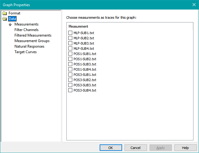
All the measurements you've imported into the project will appear in this list and be available for plotting. This includes any plot-only measurements you may have imported for verification purposes.
The Filter Channels Property Page
The Filter Channels property page is shown below.
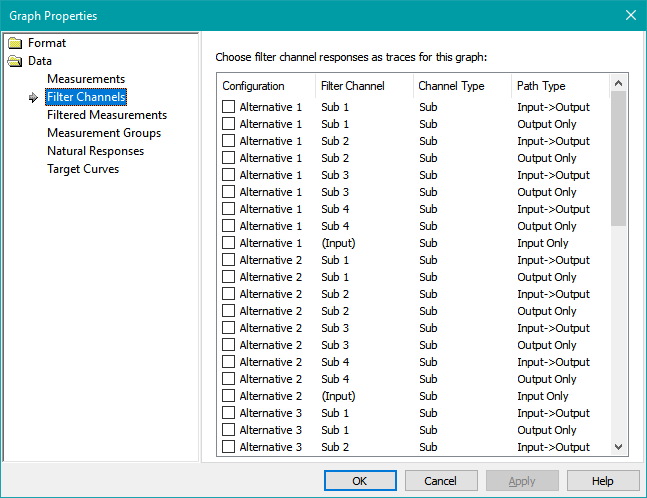
Every configuration has a collection of filter channels. All filter channels for all configurations are listed here and can be selected for plotting.
You have the choice of plotting either the entire response of a channel from input to output, or just the output portion. This is of interest to people who are using both input and output filters, and want to look at only the portion of a channel's frequency response that's unique to that sub or speaker. This could be to make sure there isn't excessive attenuation of a given sub or speaker relative to the others.
You can also plot only the response of the input (shared) filters. These alternatives are pictured above.
Possible Differences Between MSO and miniDSP Graphs
Some miniDSP users have remarked that when they load the biquad information for a channel into their device and display that channel's response in the miniDSP software, the channel response does not always match up with MSO's displayed response for that channel. There are three things you can check to track this down.
- Make sure the correct sample rate has been chosen on the Filter Reports property page of the Application Options property sheet. For the 2x4 HD device, the correct sample rate is 96 kHz. For the non-HD 2x4 devices, the correct sample rate is 48 kHz. Some miniDSP devices have a sample rate that depends on which firmware is installed (such as Dirac vs. non-Dirac versions), so check the miniDSP documentation for details to make sure the sample rate you entered into MSO is correct for your configuration. If the wrong sample rate is chosen in MSO, the biquad coefficients exported from MSO will also be wrong, making the actual DSP filter responses radically different from the predicted ones. If this is determined to be the case, you must choose the correct sample rate in MSO, export all channels as biquad text using this new, corrected sample rate, then import the new biquad text files into the miniDSP. There is no need to re-run an optimization in that case.
- The miniDSP software (presently called the Device Console) displays only the response of the biquads in the channel, omitting any gain settings. MSO displays the response of all filters and all gain blocks in the channel. This is becoming less common nowadays, as the trend toward maximizing SPL leads to a requirement for eliminating output-channel gain blocks.
- The miniDSP software as of this writing does not have variable y-axis limits for its graphs. If the filter response computed by MSO exceeds the graph limits in the miniDSP Device Console software, it is displayed clipped at the graph limits. This leads some people to assume that the actual response of the filters themselves is clipped in this way when it is actually not. This is a bug in the miniDSP graphs, not in MSO.
The Filtered Measurements Property Page
The Filtered Measurements property page is shown below.
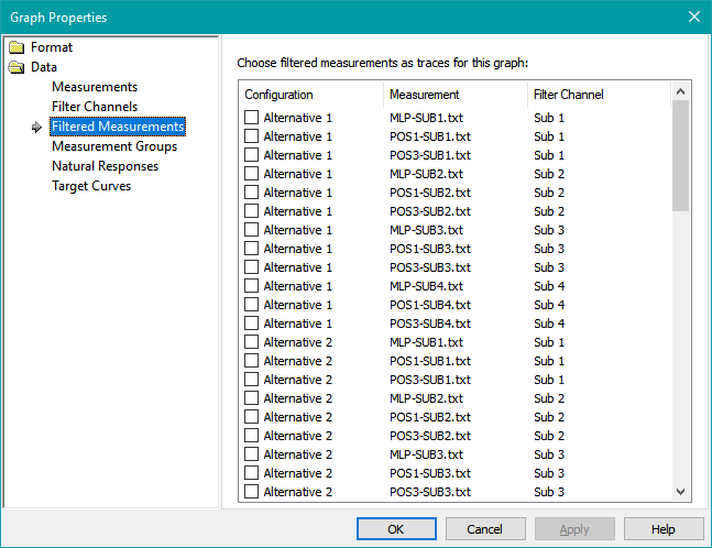
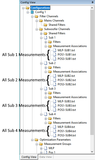
In MSO, each configuration has a collection of filter channels, where each filter channel drives a sub or main speaker. Each filter channel is also associated with a collection of measurements. These measurements are for all the listening positions measured for the sub or speaker that's driven by that channel. An example of this situation is illustrated below.
Each measurement is modified by the frequency response of the channel with which it is associated. The Filtered Measurements you can choose to plot on the graph are these measurements modified by their associated channel's frequency response. The three identifying factors that define such a trace to be plotted are the configuration in which a channel can be found, the name of that channel, and the name of the measurement that channel is filtering.
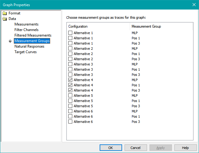
The Measurement Groups Property Page
The Measurement Groups property page is shown below.
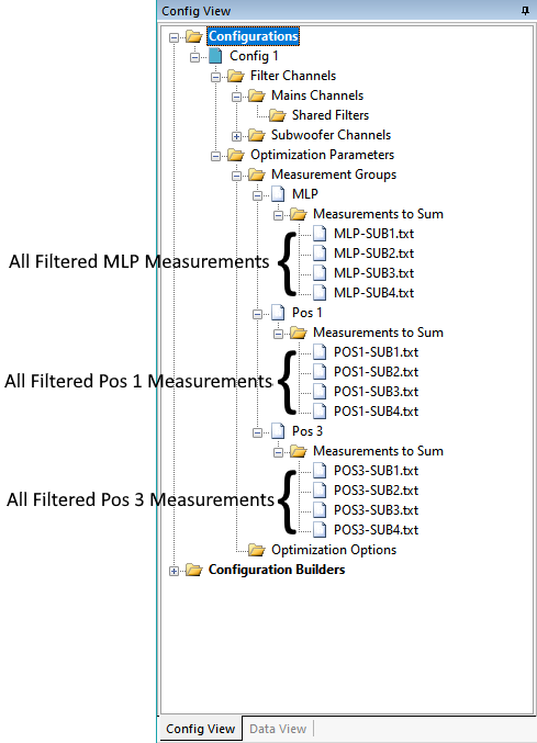
With normal usage of MSO, a Measurement Group represents the predicted response at a listening position. This response is calculated using complex summation of all filtered subwoofer measurements taken at that position. These filtered measurements add up to the predicted frequency response at that listening position. This is illustrated below.
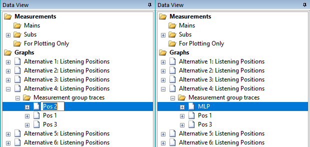
When you create your configuration with the Configuration Wizard, the wizard automatically adds one such trace for each of the listening positions you defined in the wizard. If you wish to compare configurations on a graph, you'll need to add traces from another configuration to the graph via this property page.
The Natural Responses Property Page
The Natural Responses property page is shown below.
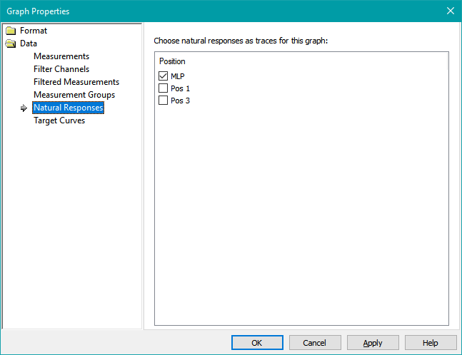
The natural response at any listening position is what you'd get without any filtering in the idealized case where all the subs are acoustically in phase with one another at all frequencies at that position. At the lowest frequencies, these responses show how much output you could expect with perfect phase matching. At the highest frequencies, they show what the response at that position would be without any phase-related interference between subs (which sometimes gives a hash-like appearance in the combined sub responses).
This type of trace is useful when evaluating results from an SPL optimization run. In the ideal case, the results of such an optimization at each listening position should be pretty close to the ideal "natural response". If it isn't, this could be due to having a combination of ported and sealed subs, possibly requiring an additional all-pass filter in each channel of the sealed subs. It could also point to the need for a polarity inversion in unusual cases.
The number of available traces here will always be equal to the number of positions, regardless of how many configurations there are. This is because the natural curves are calculated only from the raw measurements, and don't depend on any configuration-specific processing in any way.
The Target Curves Property Page
The Target Curves property page is shown below.
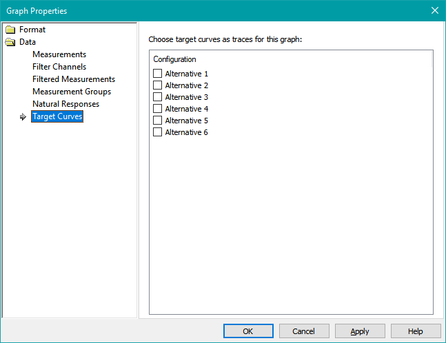
Each configuration has a target curve associated with it, even if no target curve was imported for the configuration. If no target curve was imported, the target is a flat response. Target curves are shifted according to the graph options listed above in the Target Curve Display radio buttons of the Axes property page. A flat target curve trace can be used to show the reference level by choosing the Shift to reference level option of those radio buttons.
Property Pages: The Trace Properties Category
The Trace Properties category differs from the others we've discussed in several important respects.
- The Graph Format and Trace Data Types categories each have a fixed set of subitems, and selecting a subitem activates a property page that's unique to that subitem type. The Trace Properties category has a variable number of subitems, with one subitem per trace that was added either in the property pages of the Trace Data Types category, or automatically by the Configuration Wizard.
- Selecting a trace under the Trace Properties category always activates the Trace Properties property page for that trace.
- The text labels of the subitems of the Trace Properties category are the trace names. These labels can be edited, and doing so renames that trace.
- You can remove traces from the graph by selecting the trace subitem and pressing the Delete key.
- There may be no traces at all under the Trace Properties category if no traces have been added yet by property pages under the Trace Data Types category. In that case, selecting the Trace Properties category itself will still activate the Trace Properties property page, but all of its controls will be disabled.
Using the Trace Properties Property Page
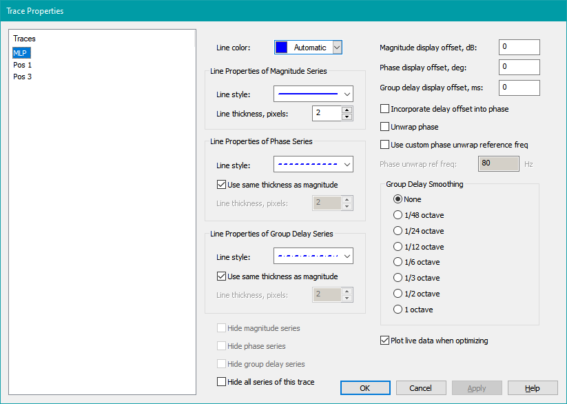
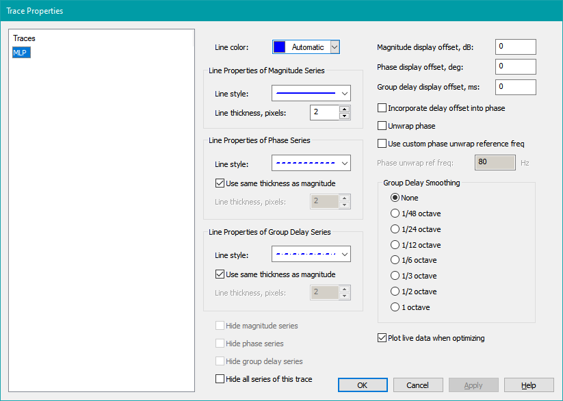
Once you have specified the data you wish to plot, you may want to customize the appearance of the graph traces and their series that display the data. You do this using the Trace Properties property page. This property page is shown below.
Changes Are Immediately Detected and Applied Without Needing To Press Apply
The changes you make on the Trace Properties property page are immediately detected and automatically applied to the graph as you type them or use the mouse. Because of this immediate application, the Apply button is almost never needed when working with this property page. This means the Apply button is almost never enabled, except in the specific circumstance described below.
When the Apply Button Is Enabled
In order to immediately apply the changes you enter, that data must be valid. If for some reason you accidentally enter, say, a non-numeric character into an edit control that expects a number, that data can't be applied and the previous property value for that control is left unchanged. However, no error message is shown, as doing so would mean the property page could bombard you with error messages before you even finish your data entry into these edit controls.
Instead, if an edit control contains invalid data, the Apply button is enabled. If this ever occurs and you're not sure of the reason for it, just press the Apply button. This will show an error message describing the situation and highlighting the text of the edit control that needs to be corrected. Once you fix the error, the change is immediately applied to the graph and the Apply button is once again disabled, indicating valid data.
The Line Color Control
The Line color control allows you to modify the color of the chosen trace. All series of a given trace (magnitude, phase, and group delay) are assigned the same color. You can either choose Automatic, or manually change the color using a standard color picker dialog. The color picker allows you to either choose predefined colors or define your own.
The Line Properties of Magnitude Series Control Group
This control group consists of two controls that allow you to specify the appearance of magnitude series.
The Line Style Combo Box
This combo box allows you to choose the line style (such as solid, dotted, dashed and so on) for magnitude series. The line rendered in the combo box will have the exact same appearance as its associated plot line, including color, style and thickness.
The Line Thickness, Pixels Spin Button Control
This control allows you to set the line thickness of magnitude series in pixels. As you vary the value, the displayed line in the Line Style combo box will also change, so you can see exactly what the line will look like on the graph.
By default, the phase and group delay series will have the same thickness that you specify here, but you can modify that as described below.
The Line Properties of Phase Series Control Group
This control group consists of three controls that allow you to specify the appearance of phase series.
The Line Style Combo Box
This combo box has the same functionality as the Line Style combo box for magnitude series, but it affects only the display of phase series.
The Use Same Thickness as Magnitude Checkbox
When this is checked (the default), the line thickness of phase series will be the same as for the corresponding magnitude series. When it is unchecked, you can specify this thickness independently.
The Line Thickness, Pixels Spin Button Control
When the Use Same Thickness as Magnitude checkbox is unchecked, you can specify the line thickness of phase series independently here. It's common to use a solid line for magnitude and a dashed or dotted line for phase. Unfortunately, these non-solid lines have a more sparse appearance than a solid line having the same pixel thickness. You might want to uncheck this option and make the non-solid line one pixel thicker than the solid one to get the appearance you want.
The Line Properties of Group Delay Series Control Group
This control group consists of three controls that allow you to specify the appearance of group delay series.
The Line Style Combo Box
This combo box has the same functionality as the Line Style combo box for magnitude series, but it affects only the display of group delay series.
The Use Same Thickness as Magnitude Checkbox
When this is checked (the default), the line thickness of group delay series will be the same as for the corresponding magnitude series. When it is unchecked, you can specify this thickness independently.
The Line Thickness, Pixels Spin Button Control
When the Use Same Thickness as Magnitude checkbox is unchecked, you can specify the line thickness of group delay series independently here. The same considerations apply as for the Line Thickness, Pixels spin button control for phase.
The Controls for Specifying Display Offsets and Phase Adjustments
You can specify a graph display offset for any series type. In addition, the offset for group delay can optionally be used to alter the phase to make the displayed phase response consistent with the displayed group delay.
Each of these edit controls for specifying display offset also has a spin button control. This gives you the choice of either entering numeric text into the edit control directly, or using the spin button control to increment or decrement the offset. If you press and hold the spin button control down, the displayed series will continuously shift in real time with the offset changes.
The Magnitude Display Offset, dB Edit Control
You can enter magnitude display offsets in dB here. Magnitude offsets are useful when you want to compare listening position responses for more than one configuration on a single graph as discussed in the Applying Trace Offsets to Separate the Data topic of the Comparing Configuration Performance Using Graphs page. If you offset all the responses of one configuration by the same amount, they'll be visually separated from those of the other configuration, allowing for convenient visual comparison.
The Phase Display Offset, deg Edit Control
Phase display offsets in degrees can be entered here. Phase offsets must be used with care. The only valid offsets are ±180° (to simulate a polarity inversion) or integer multiples of 360° (including negative integers). The latter are used to line up unwrapped phase traces that may be more similar than they initially appear. Adding integer multiples of 360° to any phase angle gives a new angle that is completely equivalent to the one before the offset was added.
Any other phase offsets are invalid and their use should be avoided. This rule is not enforced by MSO, so exercise care.
The Group Delay Display Offset, ms Edit Control
Group delay offsets in ms are entered here.
The Incorporate Delay Offset Into Phase Checkbox
You can check this checkbox to observe the results of a delay offset on phase. Choosing Incorporate delay offset into phase introduces a linear phase term into the corresponding phase plot so that the effect on phase of the group delay offset you add can be observed. Practical uses of this technique are discussed in more detail in some subtopics below.
The Unwrap Phase Checkbox
To unwrap the phase (show it as a continuous curve vs. frequency), check this checkbox. If the checkbox is unchecked, the phase vs. frequency will have the normal sawtooth appearance.
The Use Custom Phase Unwrap Reference Freq Checkbox
When using phase unwrapping, an unwrap reference frequency is needed for the unwrapping algorithm. This is the frequency for which the unwrapped phase is forced to be within 0±180°. By default, MSO uses the lowest measurement frequency as this reference, but this can result in large values for the unwrapped phase at higher frequencies.
Using this checkbox, you can pick this reference frequency to be higher, forcing the phase to be 0±180° at the frequency you choose. If you're using the delay offset technique as described above, you can choose this frequency to be in the middle of the range over which the group delay is approximately constant.
Since adding integer multiples of 360° to the phase produces an equivalent angle as described earlier, this operation gives an equivalent phase vs. frequency to the default method (although it's offset by a multiple of 360°).
The Phase Unwrap Ref Freq Edit Control
This edit control is where the custom phase unwrap frequency is entered when the Use custom phase unwrap reference freq checkbox is checked. When the Use custom phase unwrap reference freq checkbox is unchecked, this edit control displays the default phase unwrap reference frequency, which is the lowest frequency of the imported measurements.
The Check Boxes for Hiding Various Trace Series
You can hide trace series in various ways. This ability is provided by four checkboxes. These checkboxes allow you to either hide individual series of a trace, or hide all the series of a trace (which is the same as hiding the trace itself).
Any of the Hide Magnitude Series, Hide Phase Series or Hide Group Delay Series checkboxes will be disabled if any of the following are true.
- Only the left y axis is assigned to a series.
- The series type is not assigned to any y axis.
- You are trying to hide the last visible series of a trace. This would mean all of the series of the trace would be hidden. You can still do that, but you'll need to use the Hide All Series of This Trace checkbox.
The Hide Magnitude Series Checkbox
If this checkbox is enabled, checking it will hide the magnitude series of the selected trace.
The Hide Phase Series Checkbox
If this checkbox is enabled, checking it will hide the phase series of the selected trace.
The Hide Group Delay Series Checkbox
If this checkbox is enabled, checking it will hide the group delay series of the selected trace.
The Hide All Series of This Trace Checkbox
This checkbox is always enabled. Checking it will hide all the series of the selected trace. This is the same as hiding the trace itself, which will cause the trace's icon in the tree view on the left of this property sheet, and in the Data View to be grayed out.
The Plot Live Data When Optimizing Checkbox
When displaying a trace whose data is affected by an ongoing optimization, by default the trace is shown in an animated fashion as its underlying data changes. In rare cases for which you wish to disable this behavior, you can uncheck this checkbox.
The Group Delay Smoothing Radio Button Group
Computing group delay requires computing the derivative of the phase with respect to frequency. Computing derivatives in this way unfortunately strongly magnifies measurement noise. For this reason, a number of smoothing options are offered, ranging from no smoothing to 1 octave smoothing.
When displaying plots showing only filter frequency responses, such measurement noise is not present, so no smoothing should be used. When displaying plots involving measurements, the group delay can be quite noisy. For such plots, a smoothing interval of as much as 1 octave is often needed.
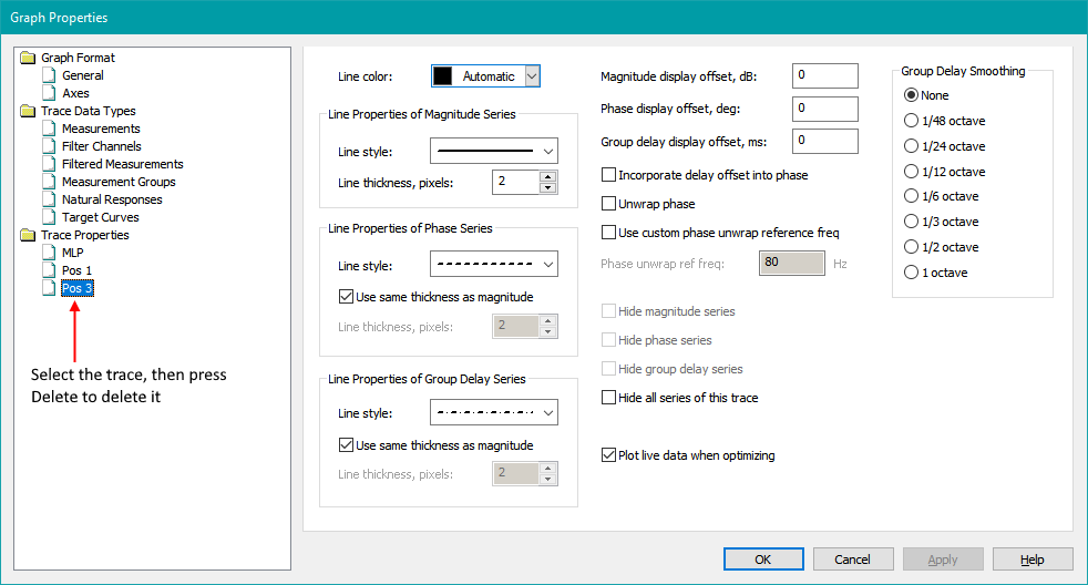
Deleting Traces
You can delete traces using the Graph Properties property sheet. To do that, select the trace you want to delete under Trace Properties in the tree view on the left. Then just press the Delete key. This is shown below.
Setting Trace Properties Without the Graph Properties Property Sheet
In addition to using the Graph Properties property sheet to set properties of graph traces, you can also set properties of a single graph trace using the Single Trace Properties property sheet. It can be launched as shown below.
Launching the Single Trace Properties Property Sheet
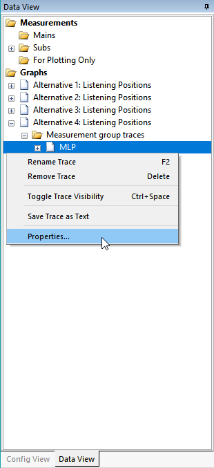
To launch the Single Trace Properties property sheet, go to the Data View, and under Graphs, find the graph whose trace you want to change. Then expand the graph node by clicking the + sign to show its traces. Next, right-click on the desired trace and choose Properties as shown below.
This will launch the Single Trace Properties property sheet as shown below.
The Single Trace Properties Property Sheet
This is just a property sheet with a single property page identical to the Trace Properties property page of the Graph Properties property sheet. For help on this property sheet, see the documentation of the Trace Properties page above for details.
Applications of Delay Offsets
The availability of delay offsets allows you to perform certain manual procedures that may be useful in some circumstances.
Finding Preliminary Sub Delay Values
A typical use for delay offsets is to obtain preliminary sub delay values. This is done by first finding a frequency range over which the group delay of the measurements of each sub to the MLP is approximately constant. This usually requires applying 1-octave smoothing to these group delay series. The resulting frequency range is often from about 50-100 Hz. You then offset each group delay series with a negative value so that the resulting delay for each series averages out to approximately zero over this range.
An example of this is shown below, where the average delay over frequency from 60-100 Hz has been forced to zero (by eye) for each of three series.
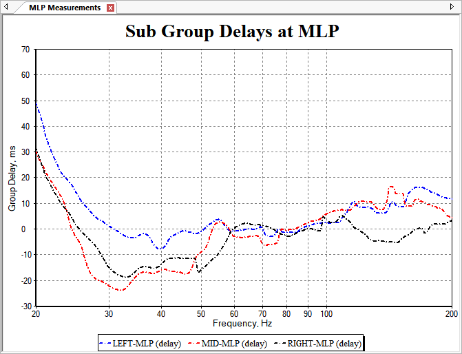
Suppose you have three subs, and the delay offsets required to get the average group delay from 60-100 Hz to zero are as follows:
- Sub 1 to MLP: offset = -10 ms
- Sub 2 to MLP: offset = -12 ms
- Sub 3 to MLP: offset = -9 ms
To approximate the required sub delays while forcing one of them to be zero, subtract the value of the most negative delay from all the delays. This keeps the relative delays the same. Here, you would subtract -12 ms from all delays, which is the same as adding 12 ms. Doing this, you'd get:
- Sub 1: delay = 2 ms
- Sub 2: delay = 0 ms (no delay block)
- Sub 3: delay = 3 ms
Finding the Sub That Requires No Delay
Using this process, we've also determined that the sub having no delay block should be Sub 2. The other delays can be constrained to positive values.
Finding Subs That Require a Polarity Inversion
To do this, use delay offsets to first force the shifted group delay series of each sub measured at the MLP to have an average value near zero over a frequency range as demonstrated above. Next, check the Incorporate delay offset into phase, Unwrap phase, and Use custom phase unwrap reference freq checkboxes. In the Phase unwrap ref freq edit control, enter a frequency value in the middle of the frequency range found above, where the smoothed group delay is approximately constant with frequency. Then, since the shifted group delays have been forced to approximately zero over this frequency range using the delay offsets, the unwrapped phase vs. frequency over that frequency range, compensated using the delay as above, will be approximately constant.
Now observe the unwrapped phase responses over this frequency range. If the steps above were performed correctly, these compensated phase responses will have been forced to be approximately constant over the chosen frequency range. If any sub or subs have a compensated phase response that's offset from the others by close to 180 degrees, such subs are likely to need a polarity inversion to match them to the others.
Saving Graphs as PNG Files
A graph can be saved to disk as a PNG file without needing to use a screen capture program. To do so, ensure that the graph you want to save in this way is visible. The two ways to save a graph as PNG are:
- Right-click on the graph itself and choose Save as PNG File... from the context menu.
- From the main menu, choose Graph, Save as PNG File...
This will launch the dialog shown below.
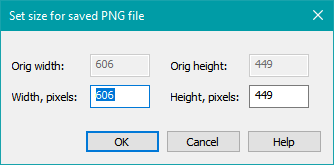
This dialog shows the existing dimensions of the graph's window in pixels. Change either the horizontal or vertical dimensions to change the pixel dimensions of the saved PNG file. When you adjust either dimension, the other one will be automatically adjusted to retain the graph's aspect ratio. If you press OK, you'll be presented with a standard Save As dialog. Navigate to the desired directory, choose a name for the file to be saved, and press OK to save the file.