Comparing Configuration Performance Using Graphs
Available Methods for Performance Comparison Using Graphs
After having optimized several configurations, you may wish to compare the performance of two or more of them using graphs. There are two different ways to do this.
- You can create a single graph containing results from multiple configurations. The example that follows immediately below demonstrates this technique.
- You can quickly compare results from multiple configurations using the graph browsing approach made available by the Multiple-Configuration Performance Metrics dialog. This technique is discussed at the end of this topic.
An Example of Performance Comparison Using a Single Graph
The example of this section shows how to create a graph containing results from multiple configurations.
For our example, we'll use the project named user-guide-8.msop from the sample files of the Getting Started Guide and the User Guide. In this example, there are six configurations. We'll compare the Alternative 1 configuration with Alternative 4. All six configurations have been optimized by the Multi-stage: Maximize SPL, minimize STSV and flatten MLP response method. Their optimization options differ only by how much the SPL penalty is allowed to increase from its optimum value in order to reduce seat-to-seat variation (STSV). This option is called Allow sub PEQs to increase SPL penalty by not more than, and is found on the Multi-Stage Options property page of the Optimization Options property sheet. This option is illustrated below.
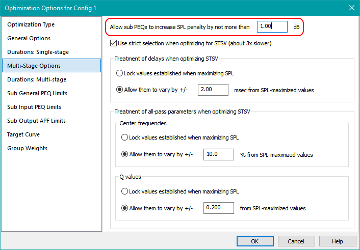
The Alternative 1 configuration allows only a small SPL penalty increase from the optimum (0.25 dB), while Alternative 4 allows the SPL penalty to increase by 1.0 dB. We should expect the STSV of Alternative 4 to be lower than that of Alternative 1, because its SPL penalty is allowed to be larger.
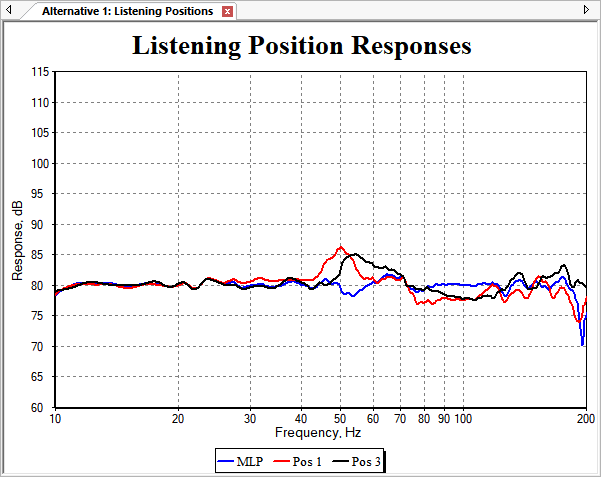
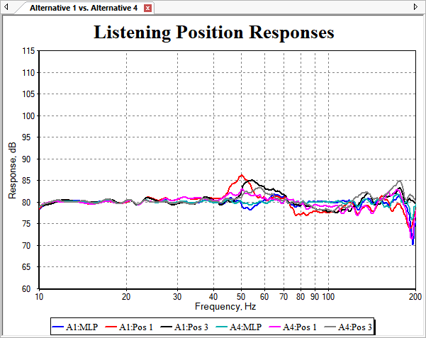
The graph of the Alternative 1 data is shown below.
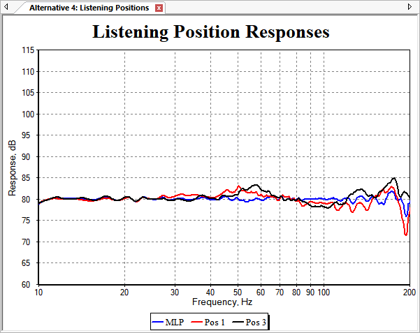
The graph of the Alternative 4 data is shown below.
These graphs were both created using the Configuration Wizard. But the Configuration Wizard creates graphs containing only data for the configuration it creates. We need a graph with data from more than one configuration, which means we must create a new graph ourselves.
Creating the Comparison Graph
To create a graph for comparing the Alternative 1 and Alternative 4 data, we could choose Graph, New Graph from the main menu. If we did that, we'd have to set all the options for axis limits, dB per division and so on from scratch. But the graphs we have for Alternative 1 and Alternative 4 both already have the axis settings and some of the data we want, so we can use the graph cloning feature to clone one of these graphs. After cloning one graph, we just need to add data traces from the other to create the comparison graph. We'll do that by cloning the graph for the Alternative 1 configuration.
This cloned graph will already contain the data from the Alternative 1 configuration, so instead of having to add all the data from both configurations we wish to compare, we can do less work by adding data from only the configuration we wish to compare with Alternative 1.
Graph cloning can be done either from the Data View by right-clicking on the name of the graph we wish to clone and choosing Clone Graph, or by using the main menu. We'll use the main menu to do so here.
From the main menu, choose Graph, Clone Graph. This brings up the Select Graph to Clone dialog as shown below.
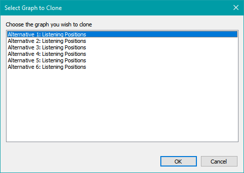
You can clone the Alternative 1 graph by selecting its name as shown above, pressing OK, hitting the Enter key, or double-clicking it. This will create a new graph with a name that's automatically generated as shown in the image of the Data View below.
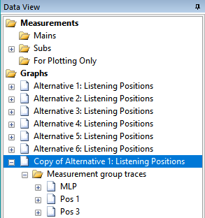
Before continuing, we'd like to change the graph name to something that describes the purpose of the graph, rather than using the automatically-generated name. Also, when we add traces from the Alternative 4 configuration, we'll have two different traces for each listening position (MLP, etc.). We'll need a way to distinguish which trace is from which configuration by inspection of the trace names. To do both of these things, we need to rename both the graph and the traces that are on it so far. One way to do this is by renaming tree items in the Data View.
Renaming items in MSO's tree views is done the same way you rename files and folders in the Windows File Explorer. Just select the item, press F2 (or click twice without double-clicking), and then you can edit the item's name in place. Using this technique, rename the graph and its traces as follows.
- Change the graph name from Copy of Alternative 1: Listening Positions to Alternative 1 vs. Alternative 4.
- Change the trace named MLP to A1:MLP.
- Change the trace named Pos 1 to A1:Pos 1.
- Change the trace named Pos 3 to A1:Pos 3.
Keeping the trace names short as above helps prevent overflow of the graph legend.
After this renaming, the Data View should look as below.
Adding the Data from the Alternative 4 Configuration
The new graph already has all the listening position traces for the Alternative 1 configuration, so we only need to add the listening position traces for Alternative 4. To do this, make sure the Alternative 1 vs. Alternative 4 graph is active and press Ctrl+G to bring up its Graph Properties property sheet.
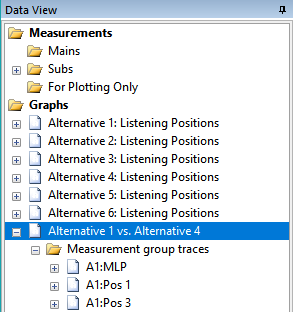
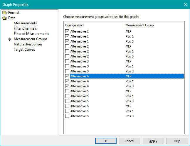
Under Trace Data Types, select Measurement Groups. Check the checkboxes for the listening positions MLP, Pos 1 and Pos 3 of Alternative 4 so that the six traces shown below are checked.
The names of the added traces are too long and will clutter the legend. Let's rename them as follows.
- Change the trace named Pos: Alternative 4: MLP to A4:MLP
- Change the trace named Pos: Alternative 4: Pos 1 to A4:Pos 1
- Change the trace named Pos: Alternative 4: Pos 3 to A4:Pos 3
Use the direct renaming technique previously described to rename the traces. After this renaming operation, the Graph Properties property sheet should look as below.
The graph with all six traces should now look as below.
Now the trace names fit nicely into the legend, but the traces are all on top of each other. We need to separate them to be able to compare the two configurations visually.
Applying Trace Offsets to Separate the Data
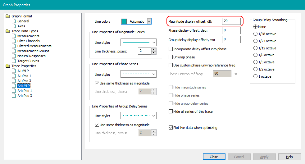
We can separate the traces by applying trace offsets via the Trace Properties property page. Both configurations use a reference level of 80 dB. If we were to add a 20 dB positive offset to, say, the Alternative 4 traces, they'd be centered around 100 dB, making them clearly separated from the Alternative 1 traces. Let's do that now.
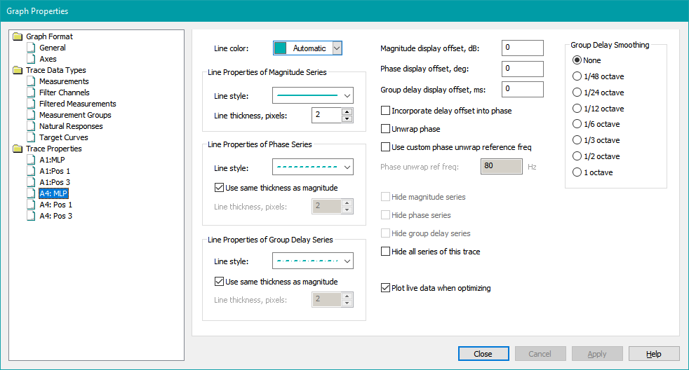
Select a trace for the Alternative 4 configuration under the Trace Properties node of the tree. In the Magnitude display offset, dB edit control, enter a value of 20. Repeat for all three Alternative 4 traces. As you enter each offset value, the offset is immediately applied as you type it, without needing to press Apply. A sample result of this data entry for the A4:MLP trace is shown below.
When you're finished, click Close or press Enter to close the dialog. The modified graph should look as below.
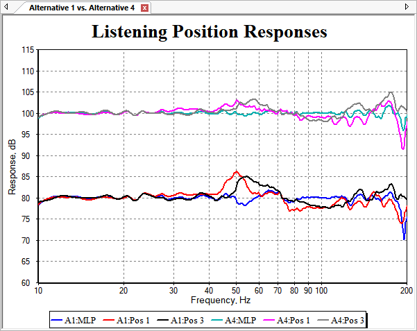
We can see from this graph that by allowing a slight increase in the SPL penalty degradation (from 0.25 dB to 1.0 dB), we've gotten a good decrease in seat-to-seat variation in the frequency range from 40 Hz to 120 Hz.
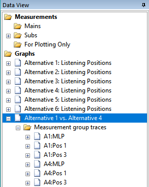
We can also see the effect of adding and renaming traces on the Data View. It now looks as below.
Having identified the frequency range over which the seat-to-seat variation has been improved, quantitative results of this improvement can be obtained by using the Configuration Metrics dialog using custom frequency ranges.
Comparing Configuration Performance Using Graph Browsing
A second method for using graphs to compare the performance of different configurations is provided by the Multiple-Configuration Performance Metrics dialog. You can launch this dialog in the following ways.
- Press Ctrl+M.
- Choose Config, Performance Metrics for All from the main menu.
- Right-click on any configuration in the Config View and choose Performance Metrics for All from the context menu.
- In the Config View, right-click on the topmost node and choose Performance Metrics for All from the context menu.
After launching this dialog, switch to the Configuration Graphs property page. The dialog will appear as below.
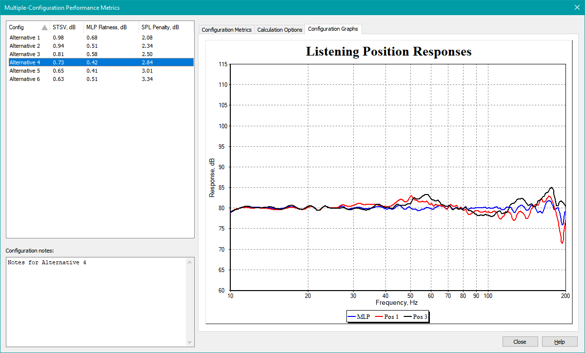
Using this dialog, you can change the selected configuration in the configuration list with the mouse or the up and down arrow keys. As you change the selection, the graph for the currently selected configuration will be shown.
For best results, the graphs should be configured so that the limits of horizontal frequency axes and of the vertical dB SPL axes are all the same.
You can control which graph is shown for a given configuration using the Associate Graphs to Configurations dialog.