Running the First Optimization
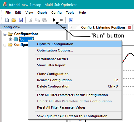
Now that we've gone through all the wizard steps and specified graph and optimization options, we're ready to run an optimization. This can be done in one of three ways:
- From the main menu, choose Config, Optimize...
- Click Run button on the toolbar.
- In the Config view on the left side of the MSO main window, select the configuration name by clicking on it. Right-click, then choose Optimize Configuration from the context menu.
The first method is straightforward. The latter two methods are shown below.
The optimization will run, either until the thirty minute time specified in the Criteria page of the Optimization Options property sheet is reached, or you press the Stop button on the toolbar. MSO uses multiple threads in its optimizer, so the time it takes to get best results depends heavily on the number of concurrent threads supported by your CPU. This can be found by selecting Tools, Application Options from the main menu, then choosing Data in the property sheet. The following result was obtained by running the optimization for about six minutes using a processor that supports eight concurrent threads.
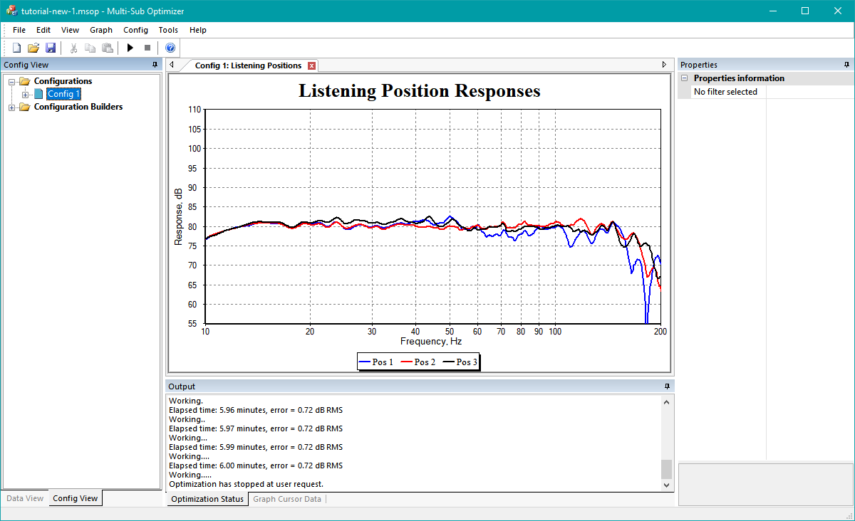
This result looks a lot better than the original data. The monster peak near 20 Hz is now gone, and the seat-to-seat response variation looks a lot less as well. Recall that we specified a reference level of 80 dB SPL on the Method page of the Optimization Options property sheet, and that this reference level was the target over the frequency range of 15 Hz to 160 Hz (as specified on the Criteria page of the Optimization Options property sheet). The graph above confirms that this target reference level has been achieved.
Now we'd like to compare the optimized results with the baseline. But how do we get the original data back?
Have We Lost Our Baseline?
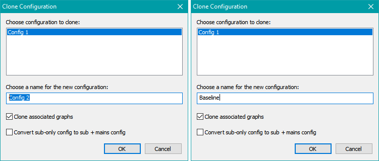
We'll get our original data back by first cloning the optimized configuration. To do this, choose Config, Clone from the main menu. This will cause the Clone Configuration dialog to be launched. In the Choose a name for the new configuration edit control, enter "Baseline", and make sure the Clone associated graphs checkbox is checked. This will create an identical copy of the Config 1 configuration, including all optimization options, graphs, and graph options. The dialog conditions before and after this change look like the image below.
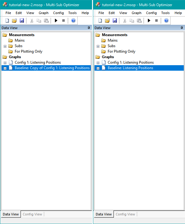
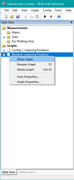
Click OK. An identical copy of the Config 1 configuration has now been created. Click the Data View tab on the lower left of the leftmost pane of the MSO main window. You can see that there are now two graphs in the project, although only one is currently showing. The newly-created one has a name that's been automatically generated, and we'd like to rename it. To do so, select the graph name as shown in the image below, and press F2 to edit it. Change its name to Baseline: Listening Positions.
When done, Right-click on this graph name, and choose Show Graph as shown below.
The main window now displays two graphs as shown below.
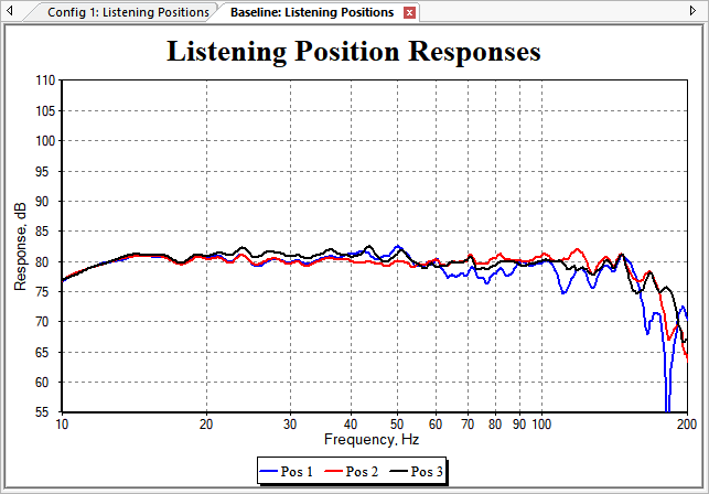
We now have two separate configurations, each with its own graph of the response at each listening position. But this so-called "baseline" isn't a baseline at all. We need a way to reset the parameter values of all the filters in the Baseline configuration so it behaves the same as before we optimized it. To do this, choose Config, Reset All Filter Parameter Values from the main menu. This will give you a dialog box asking you which configuration's filters you want to reset. This dialog is shown below.
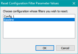
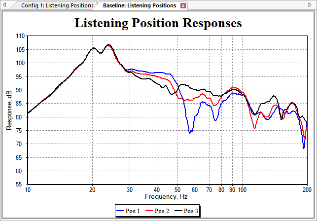
We want to reset the configuration named Baseline, so make sure that configuration is chosen, then press OK. You'll get a message box asking you to confirm this operation. Assuming you have selected the correct configuration to reset, choose Yes to confirm. This resets all PEQs back to 0 dB boost/cut, delays to 0 msec, and gain/attenuation blocks to 0 dB. The response curves of the Baseline configuration now look like they did before optimization, as shown in the graph below.
Comparing Results: Before and After Optimization
This is the simplest usage of MSO's "multiple configurations" feature: comparing data before and after optimization. In this case, we can compare the data by switching back and forth between the Baseline: Listening Positions and Config 1: Listening Positions tabbed graph windows. But that is somewhat inconvenient. We'd really like to have both the before and after conditions on the same graph.
Based on our experience going through the Configuration Wizard, it might be tempting to think of graphs as somehow "belonging" to configurations. But this is not quite right. A graph can have data from many different configurations, as well as displaying imported measurements, which are used either by all configurations, or no configurations at all (if they are the "plot-only" type).
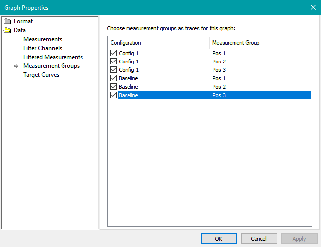
Let's create a graph for comparing the before and after data. Select Graph, New Graph from the main menu. This will create the graph and launch the Graph Properties dialog. Under Data, select Measurement Groups. These are traces representing the listening positions Pos 1, Pos 2 and Pos 3 for the Config 1 and Baseline configurations. Select all six traces as shown in the image below.
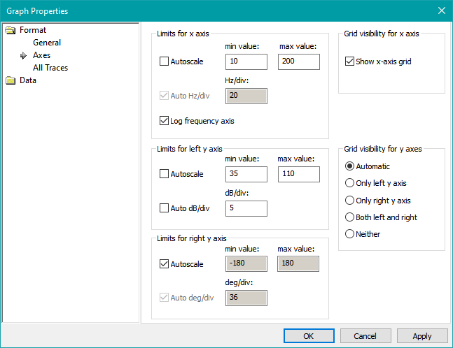
Next, choose Format, then Axes. For the x-axis, choose minimum and maximum limits of 10 Hz and 200 Hz respectively as below. For the left y-axis, uncheck Autoscale, specify minimum and maximum limits of 35 and 110 respectively, then uncheck the Auto dB/div checkbox and keep the default value of 5 for the dB/div value. The result is shown in the figure below.
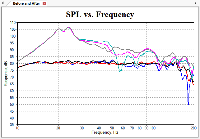
Click OK. This creates a new graph with the auto-generated name of Graph 3. Rename it as we did earlier, by selecting Graph 3 in the Data View, pressing F2, and entering the name Before and After. The graph now looks like the figure below.
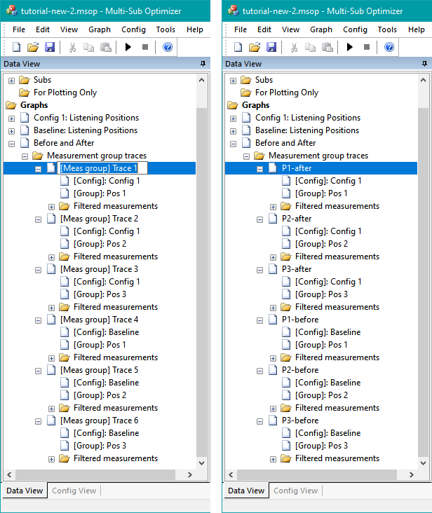
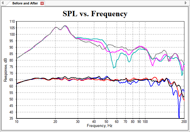
This is good, but the traces from Config 1 and Baseline need to be separated. In addition, we'd like to have a legend with meaningful but short trace names. Unfortunately, the trace names are auto-generated for new graphs that are manually created, so we'll first have to give the traces meaningful names. Click the "+" sign next to the Before and After graph node in the Data View. This shows the auto-generated name, along with the data that each trace represents. You can see, for example, that the first trace, named [Meas group] Trace 1 is for Config 1 at Pos 1. You can rename this trace by selecting [Meas group] Trace 1 and pressing F2. Change it to be P1-after. Likewise, do so for the other five traces. The image below shows the conditions before and after renaming the graph traces.
Next, we'll shift the Config 1 traces (the "after" condition) down by 15 dB. To do this, right-click on the graph and choose Trace Properties... Select each trace with "-after" in its name, and in the Magnitude display offset, dB edit control, enter -15. Make sure all the "-before" traces hav 0 dB offset, and all the "-after" ones have -15 dB offset. This is shown in the figure below.
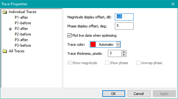
Note that without having previously renamed the traces to identify which one is "before", and which "after", these trace manipulations could not have been done in a reasonable way. Press OK to see the new graph.
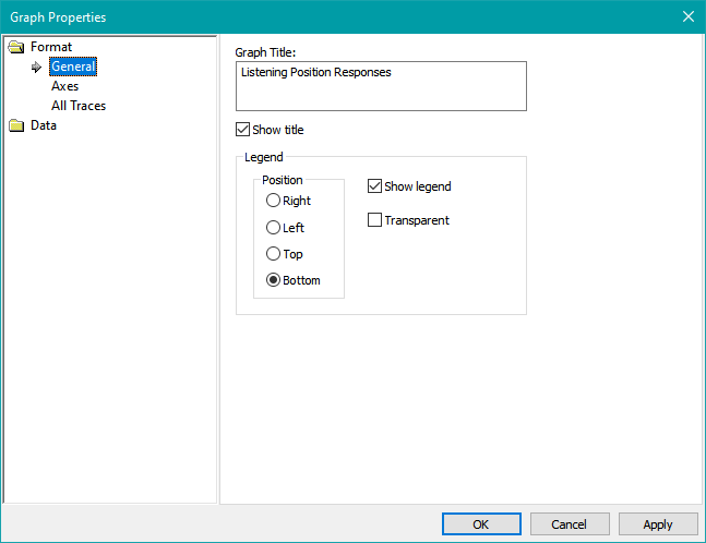
This is looking pretty good now. Let's finish it up by adding a legend, and changing the default title of "SPL vs. Frequency" to "Listening Position Responses". Right-click on the graph, and choose Graph Properties... Enter "Listening Position Responses" (without quotes) into the Graph Title edit box, and check the Show Legend option. The Graph Properties dialog should look as below.
Press OK when done. Now the graph has a legend and a more appropriate title as shown below.
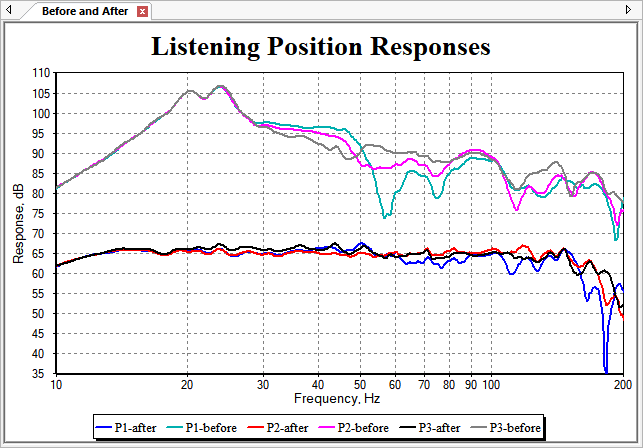
This is looking more complete now. Try right-clicking on the graph and choosing Show Data Cursor. By moving it to 56.6 Hz, the data for the different traces can be seen, as shown in the table below. You may need to maximize the MSO main window for the data cursor to be able to capture this exact frequency.
| Graph Data | Value |
|---|---|
| Frequency | 56.6 Hz |
| P1-after | 64.2 dB |
| P1-before | 74.3 dB |
| P2-after | 64.4 dB |
| P2-before | 86.2 dB |
| P3-after | 63.9 dB |
| P3-before | 91.1 dB |
Cursor Data at 56.6 Hz
The "before" data ranges from 74.3 dB to 91.1 dB, for a total variation of 16.8 dB. The "after" data ranges from 63.9 dB to 64.4 dB, for a total variation of 0.5 dB. This illustrates the ability of individual sub equalization to reduce seat-to-seat response variation.
To dismiss the data cursor, right-click on the graph and choose Hide Data Cursor.
Although this is a big improvement over the original condition before optimization, there's still an annoying dip in the response of the P1-after trace at around 181.9 Hz. That frequency is outside our current optimization frequency range, so fixing it involves increasing the maximum limit of the optimization frequency range. In the next section, we'll make another try to see if we can fix it.
Now is a good time to save the MSO project. This state of the project is saved in the file tutorial-new-2.msop in the downloadable tutorial examples.